


Beauty Product Reviews | Page 23
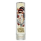
Interesting but Refined scent
I got this perfume as a Christmas gift quite some time ago. It has a very unique but pretty scent. When I spritz it on I feel a little sophisticated and put together. I also adore the packaging. I'm not a big fan of the Ed Hardy franchise, but the Asian, tattoo inspired graphic on the front of the bottle is beautiful, as well as the actual container- a long, slender and elegant tube whose cap slides down like a sheath. The cap is champagne in color with faint Asian art designs swirled through out and is finished off with the signature Ed Hardy design. I would recommend this product for sure, because of its design and especially for the unique and pleasant scent held within.
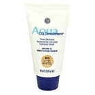
My go- to TM but still average
After buying a gazillion drugstore TM's I settled with using this one exclusively. My initial impression was that the texture was instantly better than all the others I had tried. Most TM's seem to drag across my face and I don't get that even application/sinking into my skin feeling. This tinted moisturizer is creamy and opaque- obviously when its deposited in your hand in a concentrated dollop. The first time I used it I thought I saw a marked difference, although the typical SPF shine was there. Now, I don't feel like it makes a huge difference, but it works well when combined with Cover Girl/Olay's concealer and some Maybelline translucent finishing/setting powder/veil to cut down the shine. I'll continue to use it up, and maybe re-purchase because its texture and feel is so much better than the other drug store brands and its also not overtly orange, which is a plus. So the texture is great, color is great, but coverage is so-so/typical.
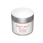
Love it
Love this! The packaging and design are elegant and classy (I also have a thing for makeup/products that are in tubs/cute containers). The jar is a little heavy, as its made from glass, maybe even plexi glass, not so sure. So it is a little chunky and I would recommend storing this in a little zippered pouch or pocket when traveling, or even at home, to keep it protected from possible breakage. The actual product smells heavenly- its created from a mix of interesting natural, botanical ingredients, so the scent has a unique, one of a kind quality. I also love the texture. This cream is thick and creamy and applies wonderfully, like silk on my skin. Because my skin is so very parched, I can apply a nice little glob all over and within minutes my face has absorbed all the moisture. Burt's Bees is a fantastic brand, and I have yet to find anything shady about their products or practices (although I am not completely trusting about any cosmetic brand, even Burt's, because they are such a huge company). The ingredients are free of your typical, added foaming, thickening and preserving agents, like lauryl sulfate, parabens, etc. However, the Radiance line also includes a Radiance Night Creme, as well as this Day Creme I am reviewing. Since I like to throughly inspect a product before purchase, including scanning the ingredients, I'm pretty sure I noticed that the Night Creme consists of the same ingredients as the Day Creme, so buying both (unless you know you like it and want to stock up on more) isn't the best idea if you're on a little bit of a budget. You can just use the one jar day AND night if you like. Another little drawback, although more significant, is the price. I cannot recall the exact price, but I know it is not cheap- maybe 12 or 13 dollars, and up. But it has lasted me a good amount of time, although I'm at the halfway point in the jar. If you're willing to splurge though, this little beauty is hard to pass up. It really is a little "Radiant" creme! ( I think the Radiance line is geared toward the anti-aging crowd, but no matter- its great for anyone!)
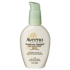
Pretty good
I have somewhat mixed feelings about this product, but I lean more to a positive stance. I really like the packaging- its elegant/pretty and as someone mentioned above, economical, as you only need 1 pump or possibly even 2. Even though its a small container it really does have a lot of product, if one only needs a few pumps to apply to the whole face adequately. However, anything with SPF, I find, is hard to rub into/over the face. It feels sticky and drags across the face a little bit, as opposed to my favored moisturizers, without SPF. I find that tinted moisturizers with SPF also have that weird, un-blendable feeling, and because of that I only use one TM, which isn't the best anyway. (I'll review it later). As far as the "glowy" look, I'm a little on the fence. I have reallly dry skin and I don't wan't my skin to come off as shiny/oily, especially since my skin is nothing of the sort. Knowing that its not an actual oily skin kind of sheen comforts me, but I hope others don't misinterpret the "glowy" sheen. What I really like to do with this product is wear it as my lazy day/rushing in the morning foundation- it doesn't hide my imperfections, but the pearlescent shine hopefully deflects the eyes away from some redness, etc. Add a little concealer and finishing translucent powder and you have a very light makeup look that is pretty natural looking. I like to use a little mascara and a Burt's Bees lip shimmer, as well as some Maybelline dream mousse blush to top it off. I hope this is helpful! (WOOPS- I reviewed the CVS version of this product!) *****
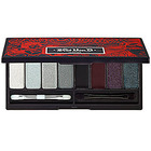
My alternative glam palette
Once I got bit by the beauty bug, I had to get this palette when I went to Sephora, for the first time. The packaging is beautiful and Kat Von D is sooo sexy. I'm impressed with most of the palette, but there are a few misses along with the hits. The Albino shade is beautiful, a white, almost creamy shimmer, but its almost held together with micro glitter, so when kicked up with a brush and applied, it makes for some fallout. That being said, it still makes a great highlighter, on the inner corner of the eye/tearduct area and the brow bone. The satiny baby blue shade located on the left is also very smooth and creamy, with less glittery fallout and more color opacity. It provides more of a wash of blue, so its not a go to for a very vibrant blue, but is a great pastel shade- I like to pair it with black liquid liner for a little pin up look. The silver, black and maroon cream shadow/liners I still need to play with- they originally dissapointed me because they creased despite wearing my UDPP, although I might need to add a little powder over the primer to make it more dry and less creamy, if thats why it creased so much. Glock, Ace of Spades and Oddfellow are also great- they make for beautiful smokey eyes and I like to use a little tape to create a sharp edge when applying these shadows- to give it a little drama and a clean line, and avoid some fallout as well. All in all its a great palette, although I think it could have been better. Love her line though, especially the design on the packaging as well as the creative names. :)
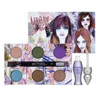
old stand by
This too was my first Urban Decay eyeshadow palette, my first ever eyeshadow palette. It basically was the evil "gateway drug" to my makeup addiction! Anyway, the shadows are great except for a few little pesky problems. The Flash purple color is not as great as the other shadows- its a little crumbly/chalky, thin and not very pigmented. This was a little annoying because the purple would have made a great little eyeliner once dampened and applied with an angled eyeliner brush. The other teensy weensy issue is my favorite go-to color in the palette, Snatch. I'm sure a lot of you guys know how great it is right on the lid with the other coppery colors blended into the crease. However, the glitter is a little fall-out-y, but just barely. If it really bugs anyone you can just do your eyes before applying the rest of your makeup, or just put a little loose powder on your cheeks and flick off the fall out with a powder brush. A little tape can help too. Anyway, I love mostly all of the colors in this palette. The colors are almost creamy for being powder shadows and are extremely pigmented. The Painkiller blue color is great as an eyeliner to give a little pop to a bronzey nude eye look. Mildew is a sumptuous olive/forest green that looks great with other color combos but with the golden/bronze shades in here, its beautiful, especially with Toasted. And Toasted is a very unique shade as well. I also love the artwork/artist who designed the cover of the palette! Anyway, great palette all in all and I'm thankful this is the palette that got me into the world of makeup :)
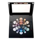
a great go to for everyday and special occasions
That really stinks that you guys were not satisfied with this product- I get bummed too when the MU you purchase is totally crappy. I have to say that I love this palette. The booklet is a little darling, and really helped me when I was just starting to get interested in more "professional" makeup. You can copy the looks or edit and change them however you want. Mixing and matching colors from the color wheel family is also cool, although I'm so satisfied with sticking within the color family trios I haven't needed to experiment much. I will say that I have a hunch that the cooler colors might be a little chalky and less pigmented and the opposite side, the warmer colors are more lush, creamy and pigmented. The cooler ones might perform better when wet or with a base, and honestly- they might be just as good, but I was blinded by the amazing-ness of the warm shades! I'm sure the consistency and overall acceptability of each shadow is different palette to palette. Some of the shadows irritated my eyes, but again, I have sensitive eyes that take awhile to get adjusted to the makeup I'm wearing in that given moment. Anyway, I love the teal, rose, burnt sienna, olive, lavender, copper, gold, pink, and nude trios and I want to play more with the turquoise set up. Overall I've used this palette dozens of times to match outfits and spice up my look for special occasions and events. It was gifted for me, but the price is relatively reasonable for around $50.00, its a holiday palette I think, and its been repackaged in a pretty floral design cover, so hopefully it was successful enough to have another go around. I would give it a shout-out, although theres a possibility it got worse or better in quality since I received it, maybe two or three years ago.