Makeup Meets Color Theory

6593
Are you creatively blocked when it comes to color? If you find yourself choosing a neutral palette day after day, it’s time to amp up the color love! Since there are infinite palette combinations, it helps to understand how hues work on your face before you break out your paint box. We turn to the fundamentals of color theory for inspiration.

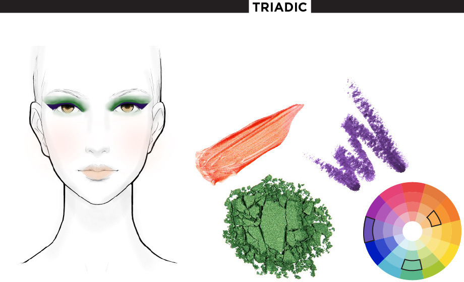
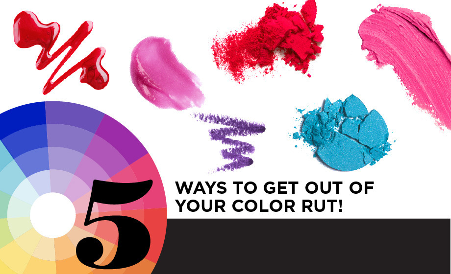
Many design professionals and artists use the color wheel (also called the color circle) when deciding on the color systems in graphic design, interior design, and art. There are many variations of the wheel, but the most common is the RYB (red-yellow-blue) color system. Let’s define some terms you should learn when looking at the rainbow circle.

PRIMARY COLORS

Three colors that can’t be mixed from any other shade. Primary colors of pigment are red, yellow, and blue.

SECONDARY COLORS

A mixture of two primary colors (orange, green, purple).

TERTIARY COLORS

Created by combining primary and secondary colors (red-orange, yellow-orange, yellow-green, blue-green, blue-violet, red-violet).

HUE

A color at its maximum intensity (the outer modules of the color wheel).

TINT

A color plus white.

SHADE

A color plus black.

SATURATION

A measure of the brightness or strength of a color.

NEUTRAL

The shade created by mixing two complementary colors.

Colors directly across from one another are called each other’s complement. Familiar complementary pairings include blue and orange, red and green, and yellow and purple. When worn together at a similar saturation, they brighten one another in a phenomenon called simultaneous contrast. For seriously vibrant eyes, dust one of these shades on the lid with the other smudged on the lash line. To create a more subtle complementary statement, mute one of the complements and let the most dramatic hue steal the spotlight. We pair a cherry lip with a pale green shadow in the inner corners of the eyes.
Similar to the complementary color scheme, a split-complementary theme couples a hue with the colors bordering its complement. For example, try applying a medium turquoise hue on the lids with a yellow-orange highlight, flush the cheeks with a sheer red-orange blush, and balance the bright look with a clear peach gloss. This kind of color scheme still gives a similar visual impact without the aforementioned simultaneous contrast.
Three or four colors adjacent to one another on the color wheel create a relaxing, harmonious effect on the eyes. Since the shades are so similar, keep the face dimensional by playing with opacity and texture. While we chose to showcase the red-violet, red, red-orange, orange section of the color wheel, any three or four neighboring colors work. Apply a sheer peach shadow on the lids and dust a shimmery coral on the cheeks. To give this look some punch, layer on a sheer magenta lip.
This color scheme forms its palette from all the tints and shades found in one single hue. In makeup, yellow makes a great monochromatic palette. Pair a smoky khaki-toned eye (a shade of yellow) with a pale, lustrous buttercup yellow gloss. To give your skin an extra boost, dust the high plains of your face with a sheer golden highlighter. Even though you’re choosing a vivid hue like yellow, the overall effect is calming in a monochromatic palette.
Want to go bold? A triadic color scheme plays with some of the wildest colors of the rainbow. This palette brings together colors evenly spaced on the wheel—typically secondary hues of green, purple, and orange. To avoid a potential makeup overdose, choose a hue as the focus and pair it with tints and shades of the other triadic tones for balance. For instance, try pairing a bejeweled emerald violet eye with nude peach cheeks and lips.
1  of  7