Loreal True Match
8
Sort By

Our customer service team in the US is ready to assist you.
Monday - Friday
7 AM – 4 PM PT
Saturday
7 AM – 4 PM PT


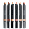
Nudestix Nude Beach 6-Piece Eye Pencil Palette
$69
Danessa Myricks Beauty ColorFix 24-Hour Cream Color Matte Sundaze
$20
Danessa Myricks Beauty ColorFix 24-Hour Cream Color Matte Oasis
$20
Danessa Myricks Beauty ColorFix 24-Hour Cream Color Matte Dreamsicle
$20
Danessa Myricks Beauty ColorFix 24-Hour Cream Color Matte Bunny
$20
Please help us maintain positive conversations here by following our guidelines below.
We reserve the right to remove comments and topics that don't adhere to the following rules. We also may remove the profile of any repeat offender. Thanks for reading and contributing!
Beautylish is a diverse, positive, and respectful community. It’s okay to disagree with someone, but be constructive—not rude. We have a zero-tolerance policy for negativity and harassment.
Take the time to make posts easy to understand by using proper spelling, grammar, and capitalization. Post topics in the appropriate category and refrain from making duplicate posts. Know that we don't allow self-promotion, advertisements, spam, commercial messages, or links to other websites or blogs. And be careful that you don't post someone else's work and present or claim it as your own.
We reserve the right to remove duplicate, miscategorized, and difficult-to-understand posts, or those we deem as advertisements, spam, or plagiarism.
Use the flag button to report inappropriate or disrespectful behavior, or email us at help@beautylish.com.
Jun 1, 2016
Dana E.
So I went on findation.com and put in my Mac shade, NC15, and it's telling me that in Loreal True Match I should get the W2 Light Ivory.
Is this site accurate at all? I'm not sure why it would tell me to get a warm undertone shade when I have cool undertones.
Also, whoever has this foundation, how do you like it? Coverage/skin type wise :)
Jun 1, 2016
Alexis C.
NC in MAC foundations is actually a warm undertone so it was correct in matching you with a warm undertone shade.
I've used Findation before and have gotten perfectly accurate results (:
I tried the True Match after hearing great reviews about it and I ended up returning it. Firstly the shade I got was a W shade (can't remember what the actual shade was now) and it was SO pink. The coverage was also pretty "meh" to me, I like at least a medium coverage and I had to apply 2 layers of the True Match to get a medium coverage.
Jun 1, 2016
Dana E.
Oh wow that's so weird. It makes it way more confusing, NC should be cool and NW should be warm lol.
Ugh really? I'm really trying to find a drugstore foundation for everyday because I only like to use my MUFE HD for nights out and I only have the IT cosmetics CC cream otherwise. :(
Jun 1, 2016
Jacqueline H.
I don't use Findnation or Temptalia, but if you wear an NC 15 in MAC, I would agree that W2 would be an accurate match in the True Match. It just depends though, because the different series of foundations in the MAC lineup don't translate as exact matches... a good example would be an NC15 in Studio Fix Fluid is a little bit darker than an NC15 in Studio Sculpt. In MAC, NC means neutral cool, so what you are getting lies in the beige territory with a pronounced yellow tone.
NC should be cool and NW should be warm lol.
Very logical thought. ;) If you are interested in why MAC labels their foundations in this fashion, let me know and I'd be happy to explain the 'why' behind it. :)
Jun 1, 2016
Dana E.
Yes please Jacqueline because it just seems so confusing 😝
Jun 1, 2016
Jacqueline H.
I know it sounds backwards, but MAC's system is technically more accurate because it is based on an artist's color wheel.
MAC really breaks down color into 4 rather than 2 (Warm or Cool) categories. Here's a way to understand it... Okay, you have to grasp the concept of warm versus cool. Warm colors will have pink/red undertones. Think of all warm shades as those than emanate from the Sun (yellow-orange, orange, red-orange, red, blue red.) Now, cool, shades are the opposite the opposite... (yellow-green, green, blue-green, blue, blue-violet.) When you look at a color wheel, view it this way... Right: W (Warm) equals Red. Then you have NW (Neutral Warm) which would be pink, and you have NC (Neutral Cool) which would be peach, and last but certainly not least, C (Cool) would be Yellow.
A good example...Many people ask: "Isn't an orange red lipstick warm and a blue red lipstick cool?" Yes and no. Red will always be considered Warm because it is the hottest color there is. There are orange-red, blue-reds, and true reds. How they look against different skin tones and undertones effects how warm and/or cool they may look. Think of your faucets in your bathroom: Your faucets use the color red to signify which direction one must move the faucet to get hot water. Blue being inherently cool, means turning your faucet in the opposite direction in order to get cool water. MAC's system really is based upon an artist's color wheel wherein North and South represent Neutrals (yellow and violet), and any color to the left (west) of yellow and violet will be Warm, and any color to the right (east) of yellow and violet will be Cool.
In MAC lingo:
NC= Neutral Cool golden beige
C= Still Cool but more yellow/golden/olive with less beige
NW= Neutral Warm pink beige
W= Still Warm but more pink and less beige
N= Truly Neutral beige neither yellow nor pink, just flat out beige.
If you ever go to an art or hobby/craft store pick up a color wheel, and you'll really be able to visualize how MAC categorizes their foundations. ;) In most every other line, Warm equals yellow and cool equals pink, but how MAC labels their foundations is technically accurate. We just aren't used to thinking of undertone in MAC terms. :)
Jun 1, 2016
Shelby M.
I have normal to dry skin and I really like the L'Oreal true match! The finish is nice, I would say it's satin. I also love that they make a shade light enough for my pale skin! It's sooo hard to find that! (I use W1 porcelain) It doesn't cling to any of my dry patches, but I think it would do okay with more oily skin as well.
As far as coverage, it's just okay. I agree with Alexis that the coverage is light to medium, but I think it's definitely buildable! Personally, my favorite drugstore foundation overall is the maybelline fit me dewy+smooth. The matte+poreless version is also really good if you prefer that finish! I just think that foundation gives a MUCH better coverage!
Jun 1, 2016
Shelby M.
Jacqueline, that makes so much more sense now! You are so insightful!
Jun 1, 2016
Jacqueline H.
Glad it helped Shelby. :)
Jun 1, 2016
Shaye M.
I was matched to nc15 but I use w1 :)
Jun 1, 2016
Aurora S.
Yes, NC15 is actually a warm undertone.
On a color wheel yellow is closer to a true cool tone (green/olive people)
I agree with Jacqueline on all of that aside from the color description of the NC and C range.
I find that the NC range is a tad more yellow then the C range in the powder and studio fix fluid. those with single digits and half shades like C2, C3, C4, C4.5 etc.tend to be yellow with a tad bit of pink in them. I find that they can come off quite peach to orange compared to the NC range. I find that the beige in the NC range replaces the slight pink tone in the C range resulting in a shade that looks a tad more of an actual yellow tone BUT I do find that the C shades with double digits (C30, C35, C40 etc)
Are MORE yellow than the NC range and they have that green/olive tone to them which the other C shades lack.
Some of the NC shades tend to have more beige in them than others so, for example, when someone goes from NC20 (which is a bit more beige compared to NC25) and tries C2 or C3, they might notice it's got a more of that undertone since the beige is not in there as much to dilute the undertone IMO
I tried a few NC shades in the studio fix powder and found it had that yellow undertone but looked a tiny bit pink.
Tried C3 and C4, too pink on me.
Then I went ahead and tried C30 and C35 and it has the yellow but doesn't look pink or orange due to the slight green tones. Matches me WAY better. I actually had a pic comparing a C shade with a single digit vs a C shade with a double digit but I think I may have deleted it
Jun 1, 2016
Aurora S.
Initially you can see that C35 has a slight green tone. C4 looks a tad beige compared to C35 but in person it actually looked quite orange.
C4 is actually closer in depth to NC30 and C30 but I don't have those on hand.
Then with the flash on you can see that C4 looks quite pink on me and C35 tends to be the right tone for me overall.
My cam gives pretty bad flashback but the shades are actually a bit darker/more saturated and my wrist is quite a bit lighter than the swatches but hopefully that was helpful with the differences
Jun 1, 2016
Dana E.
Wow I didn't realize how much there was to it! Lol. I guess that makes sense though. I'm glad you explained it because honestly I was going to go with a C shade instead thinking my match was wrong, lol. Thanks Jacqueline and Aurora :)
Jun 1, 2016
Aurora S.
Oh, and I'd also like to note that I find the L'orèal True Match to be similar to the MUFE HD as far as how it looks.
Maybe it's just me but when I wear it, it just reminds me of the HD foundation, maybe due to liquidy feel and how it doesn't look like makeup, not on me anyway but it did cover.
I find that it covers more than the Ultra HD which I had to put like 2 layers to get medium coverage.
It also depends on how you apply it.
It's a water/silicone mixture so a beauty blender will definitely soak up the product/sheer it out.
I use the shade W4 natural beige and it's quite yellow, more yellow than my MUFE HD foundation. Just make sure to really shake up the bottle and let it dry down.
When you first put it on it may seem a tad bit off.
When I put mine on it looks a tad too beige but once it dries down it matches way better, in the bottle it actually looks quite light/beige compared to some of my other foundations so some shades can be a bit misleading.
Jun 1, 2016
Jacqueline H.
You're welcome Dana. :) It sounds more complicated than it is, but once you get used to looking at different foundations and how each particular company labels them in terms of undertone, you'll be able to see the undertone of the foundation with greater ease.
Aurora and I will never agree with how to describe and/or label NC and C shades or on certain aspects of color theory. Different opinions do make the world go round... :) For a very basic general description, when dealing with an NC or C, you will be dealing with different concentrations of beige and yellow. :)
I wear W3 in the True Match this time of year, and I agree with a majority of how Aurora describes this foundation, although in my opinion, I would not liken it to MUFE HD, but that's just me. They are 2 different foundations that look very different on the skin. The L'Oreal has more of a semi matte finish...it has a drier looking finish than the MUFE HD does. True Match is a really good foundation for someone that resides on the normal to oily side spectrum and wants enough coverage to even out skin tone and fairly minor skin imperfections while still keeping the complexion realistic looking. It can be easily built up to medium coverage, and for a drug store foundation, I think this is one of the better options available. :) Let us know what you think. :)